MapleTech / Aspire
How to rebrand an insurance tech firm
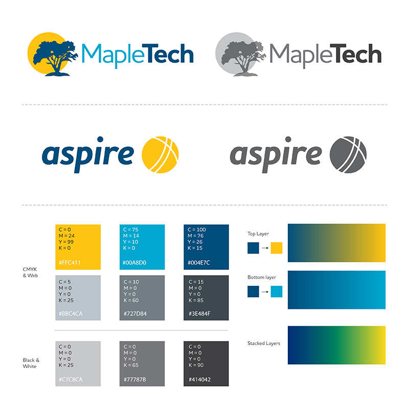
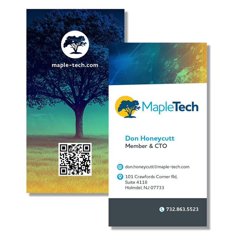
MapleTech is a company that builds software systems for insurance carriers, reciprocals, etc. Their flagship product is Aspire, which is a a core processing system for Property & Casualty insurance. I was hired to reimagine their brand system, including two new logo marks, and a fleshed out color palette and font system. The existing 'aspire' logo used a different type system then the main MapleTech logo, so I wanted to align the two logos by unifying these. The maple tree from the original logo was retained, but the color palette was given a more friendly and warm update, making it more approachable, and the tree was reframed with a glorious sun shape. These elements were then implemented across social media posts and email headers, as well as promotional materials like case studies, sell sheets and trade show material.